About
Kuwento (Brand Story)
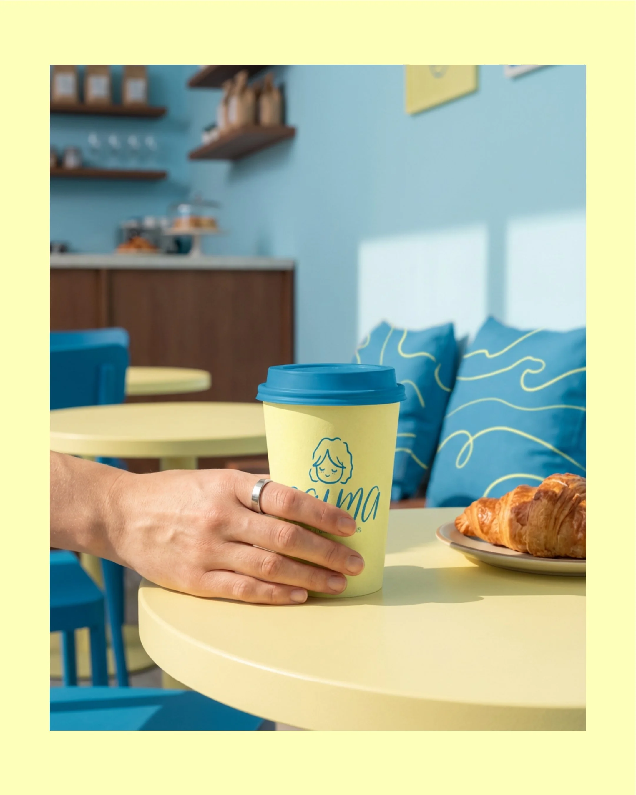
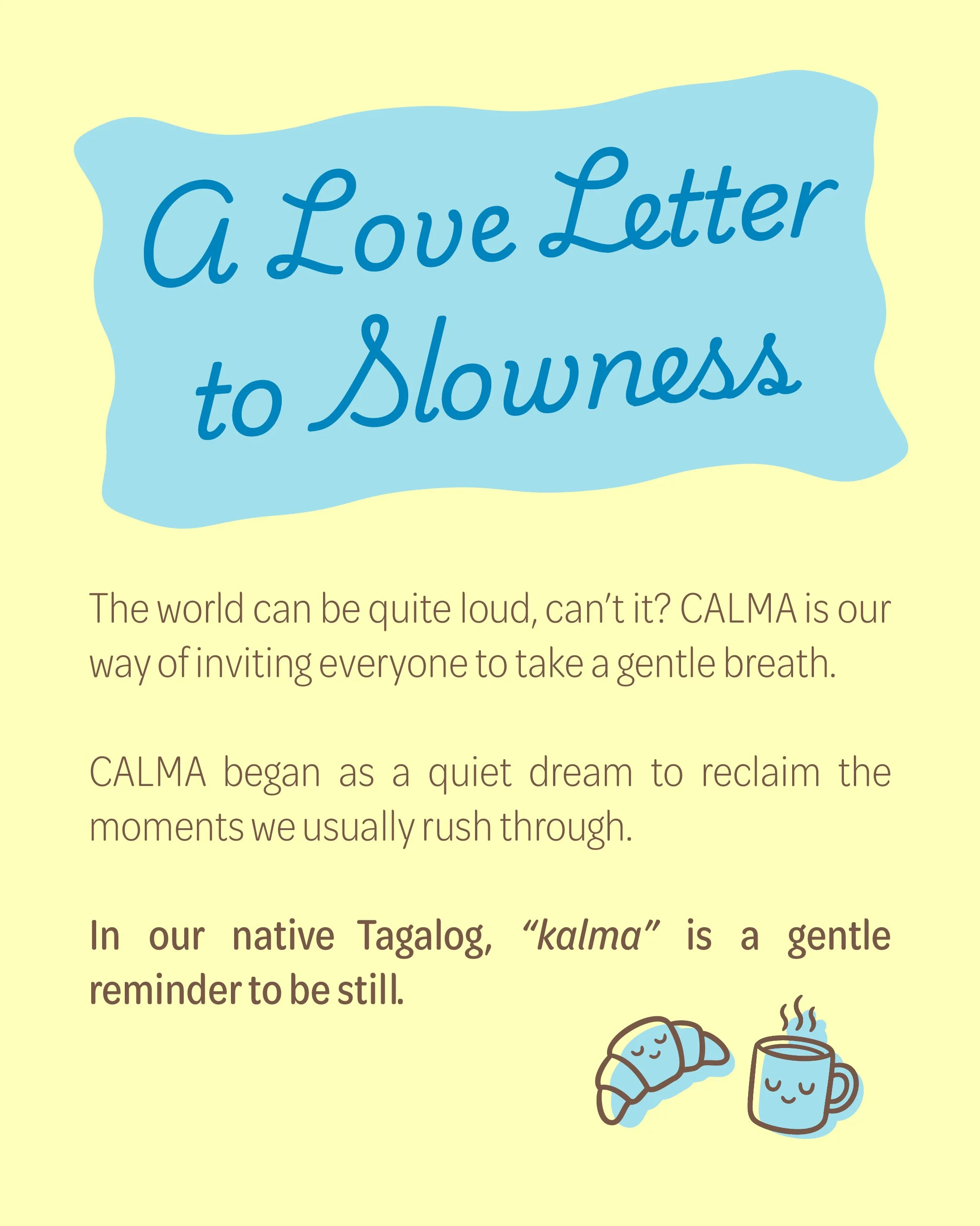
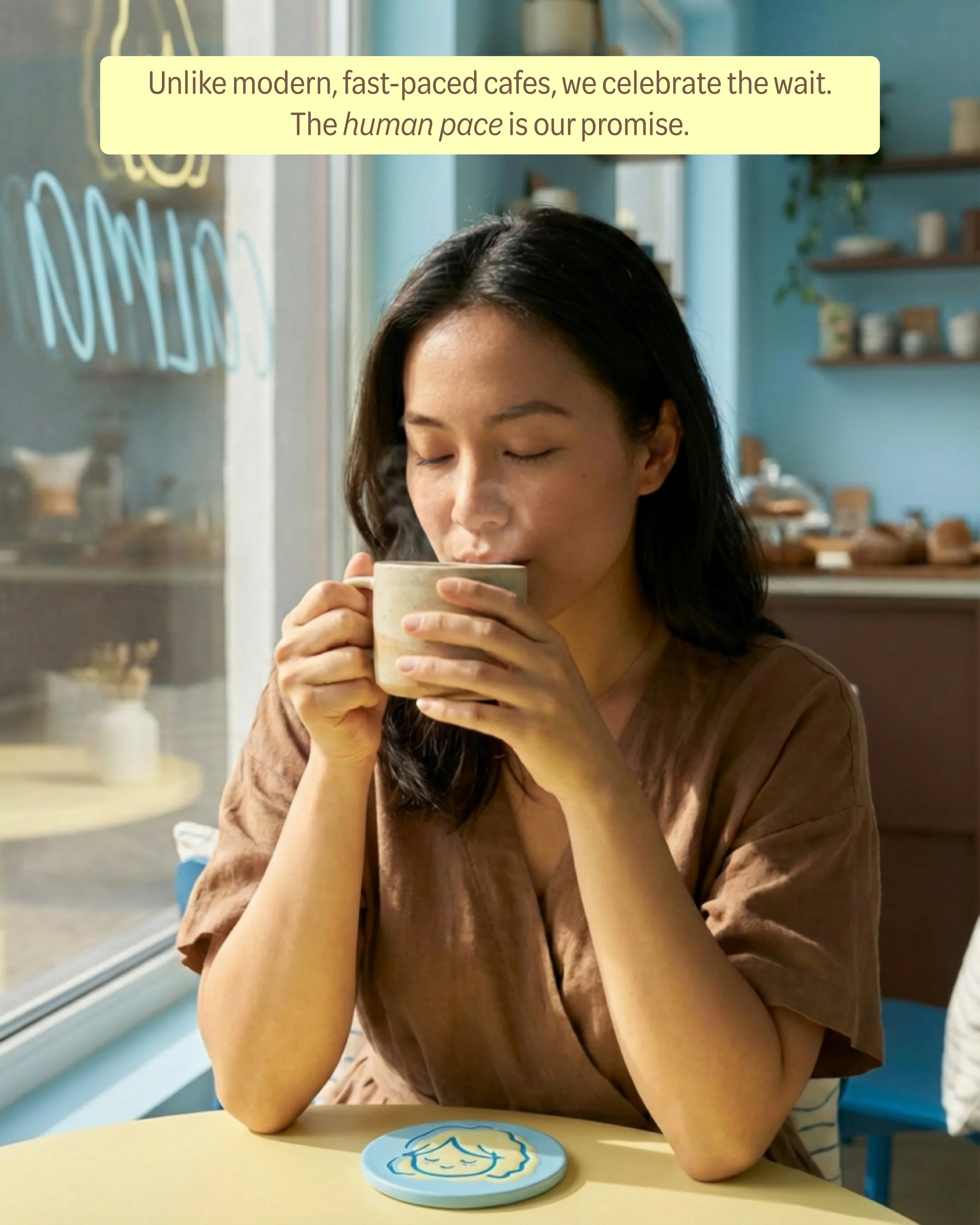
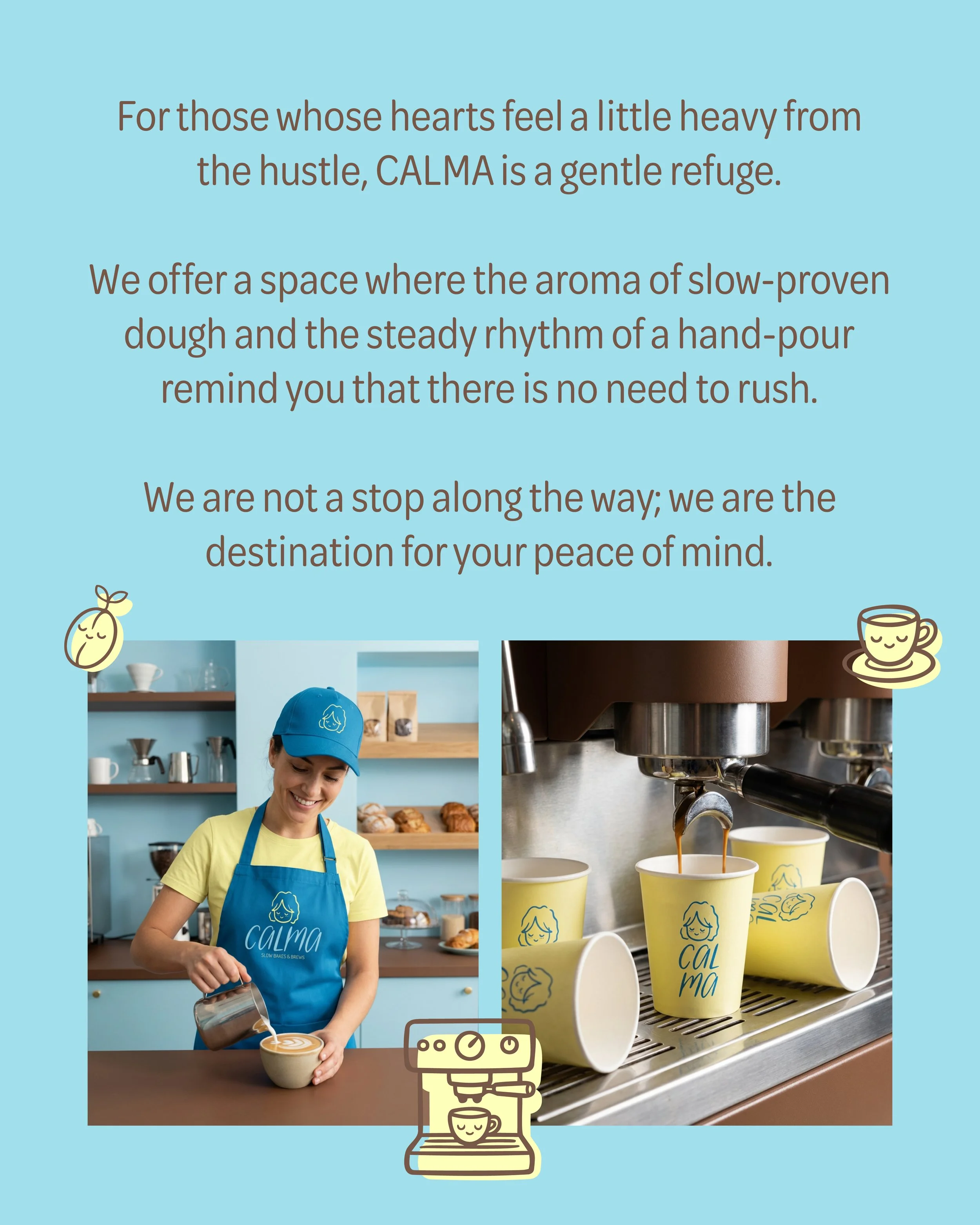
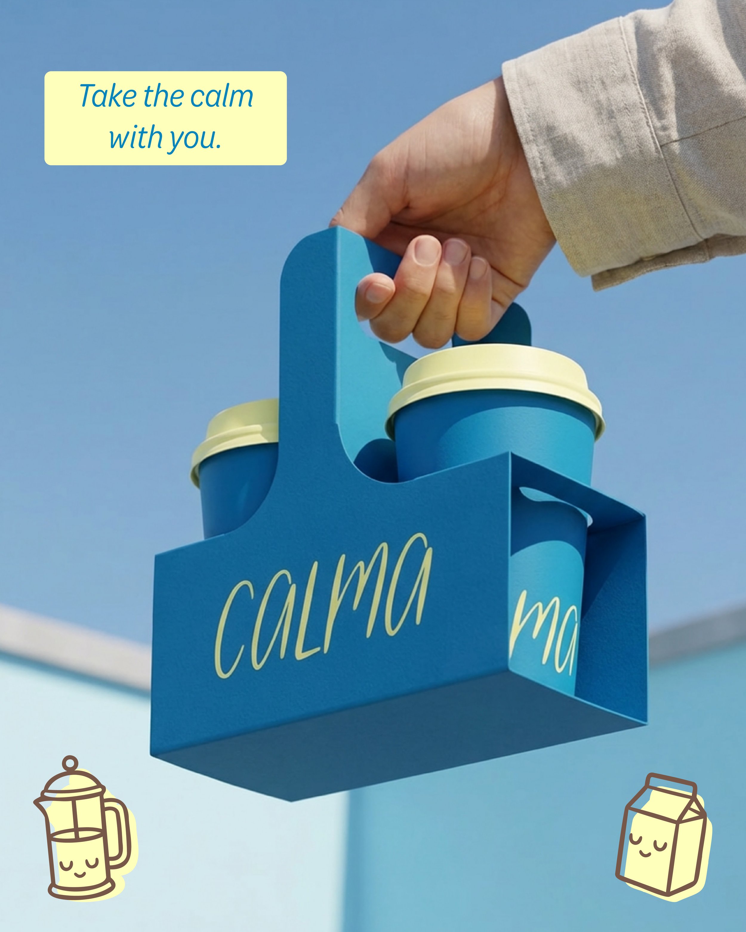
CALMA is a slow-living café rooted in the belief that rest is not a luxury; it’s a necessity. Inspired by the Tagalog word kalma, meaning “to be still,” the brand was created as a gentle refuge in a world that rarely pauses.
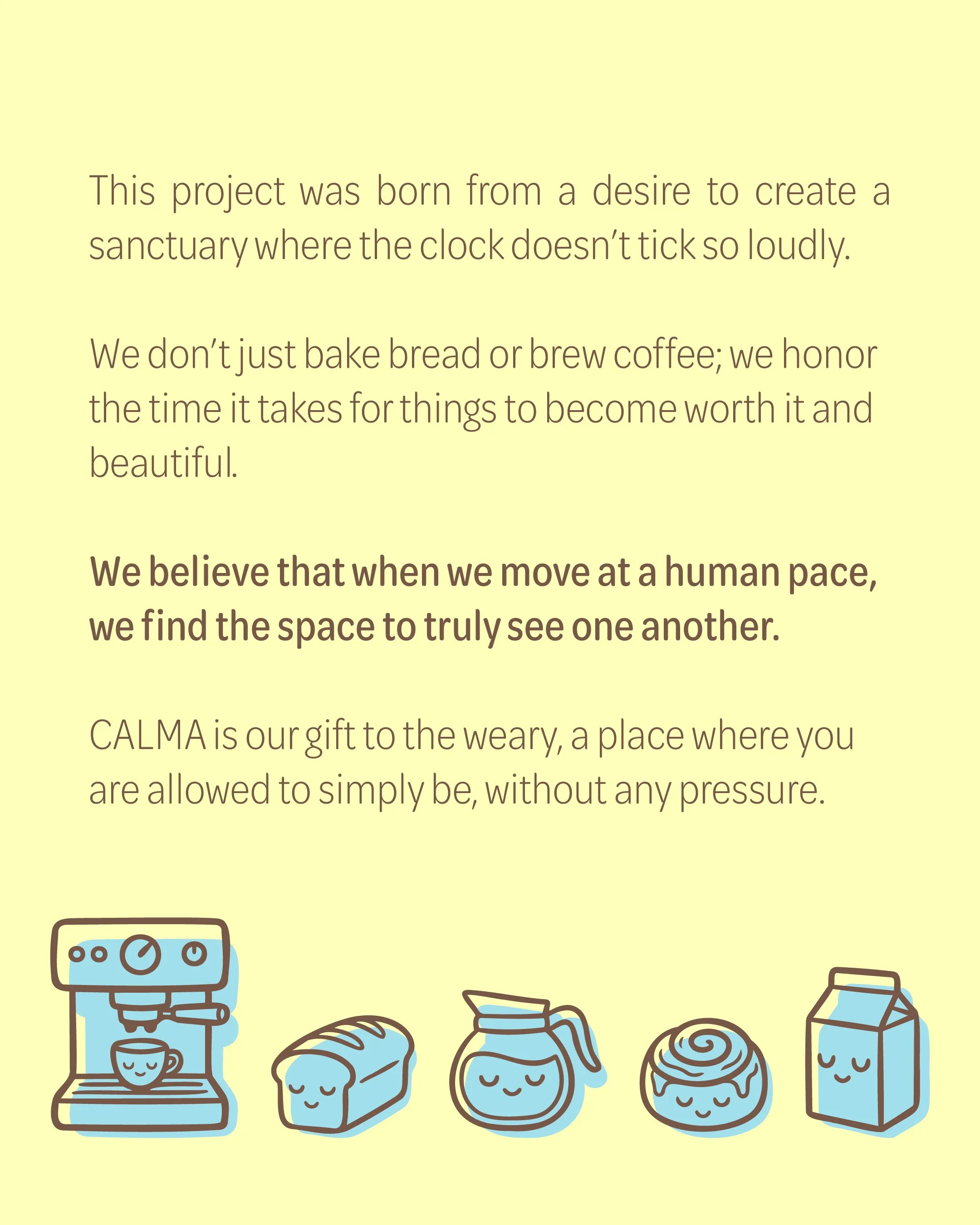
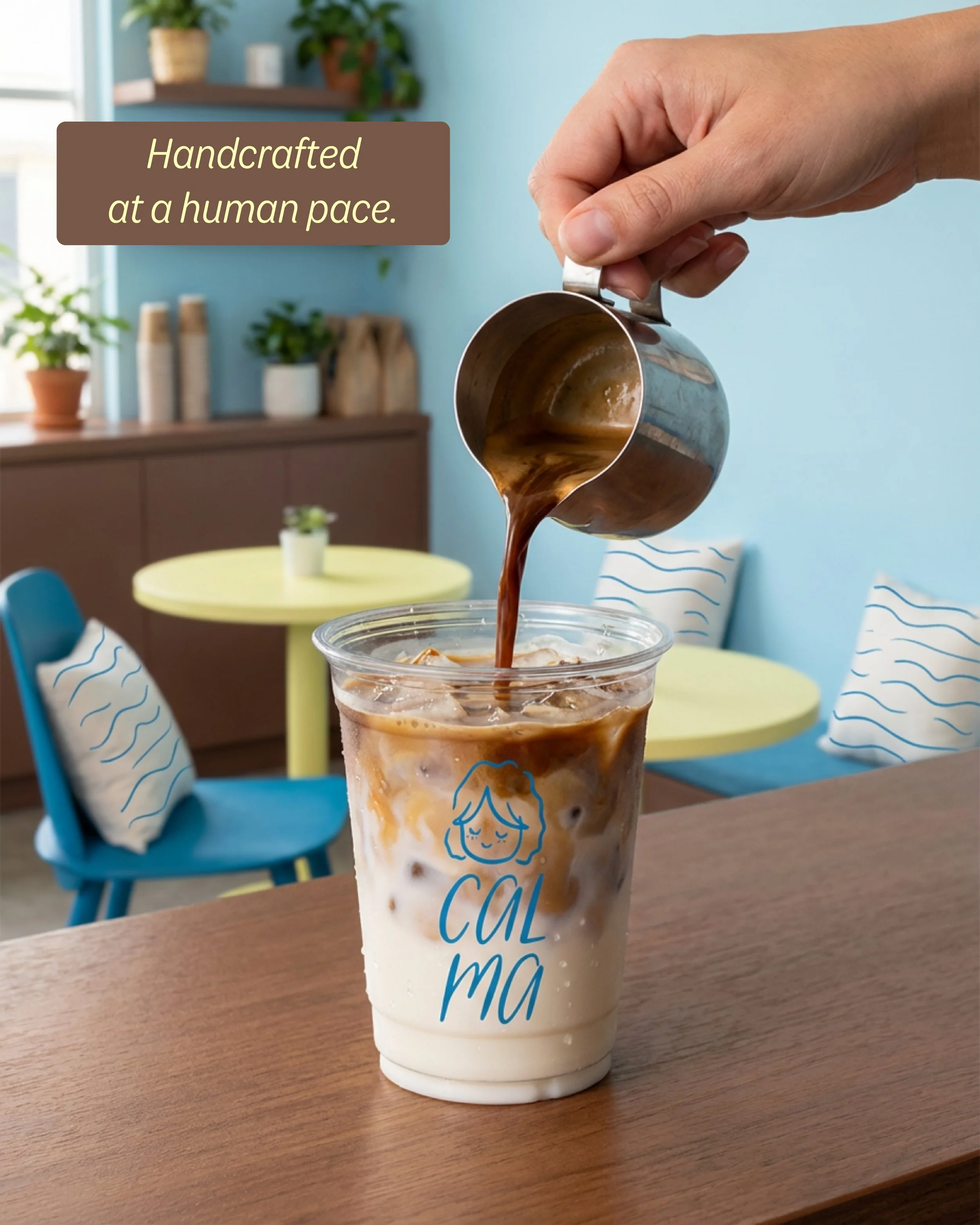
More than serving bread and coffee, CALMA honors the beauty of time — slow-proven dough, hand-poured cups, and moments that unfold at a human pace.
Why Design This?
Personally, the world feels louder and faster than ever. Modern cafés often mirror that pace, being optimized for speed and efficiency. So I designed CALMA as a counterpoint.
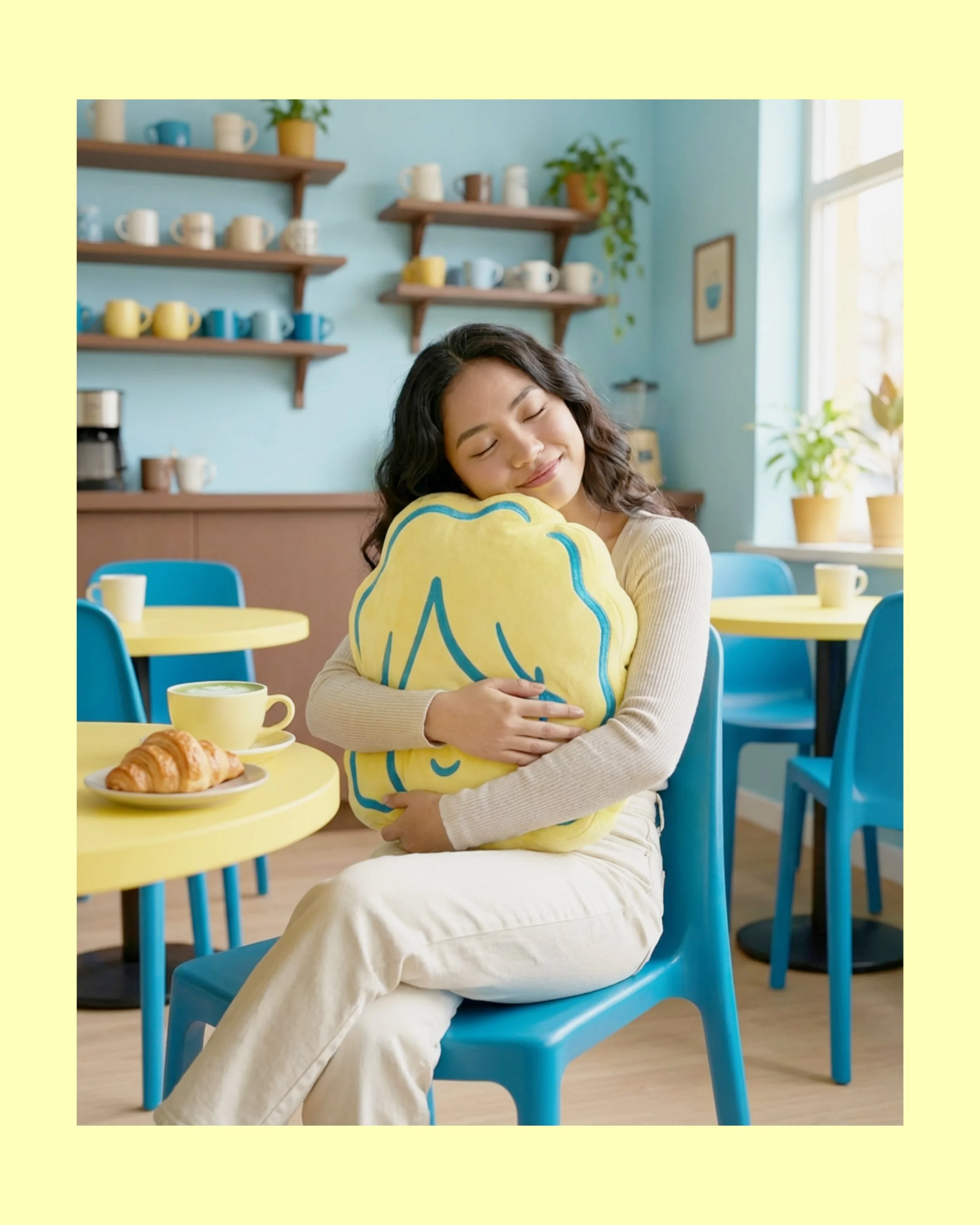
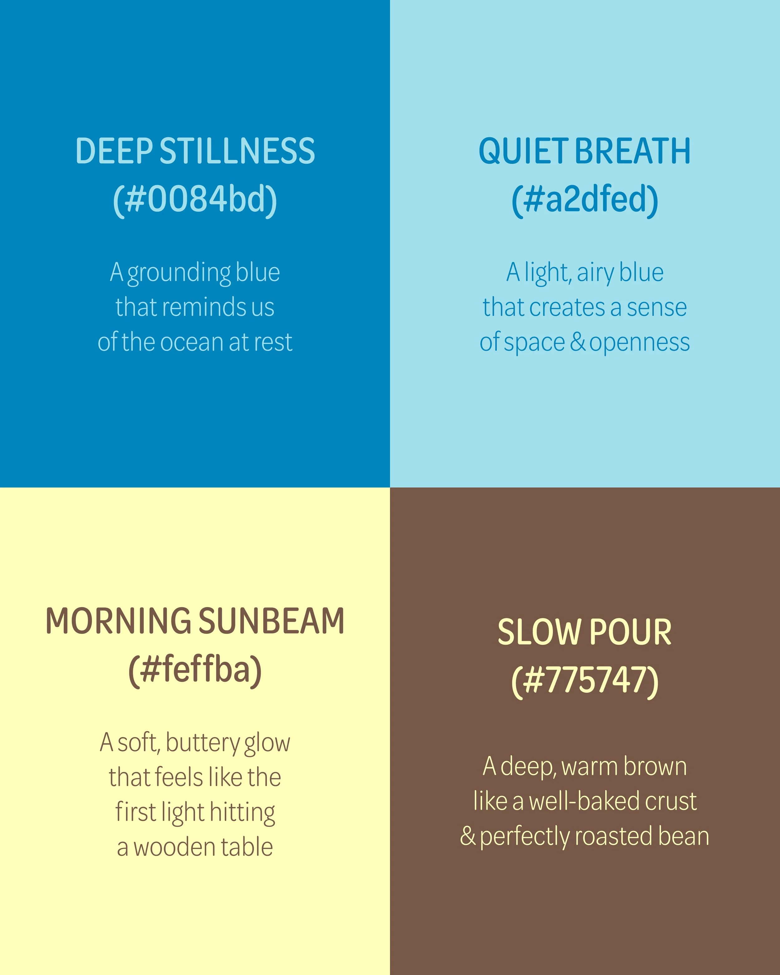
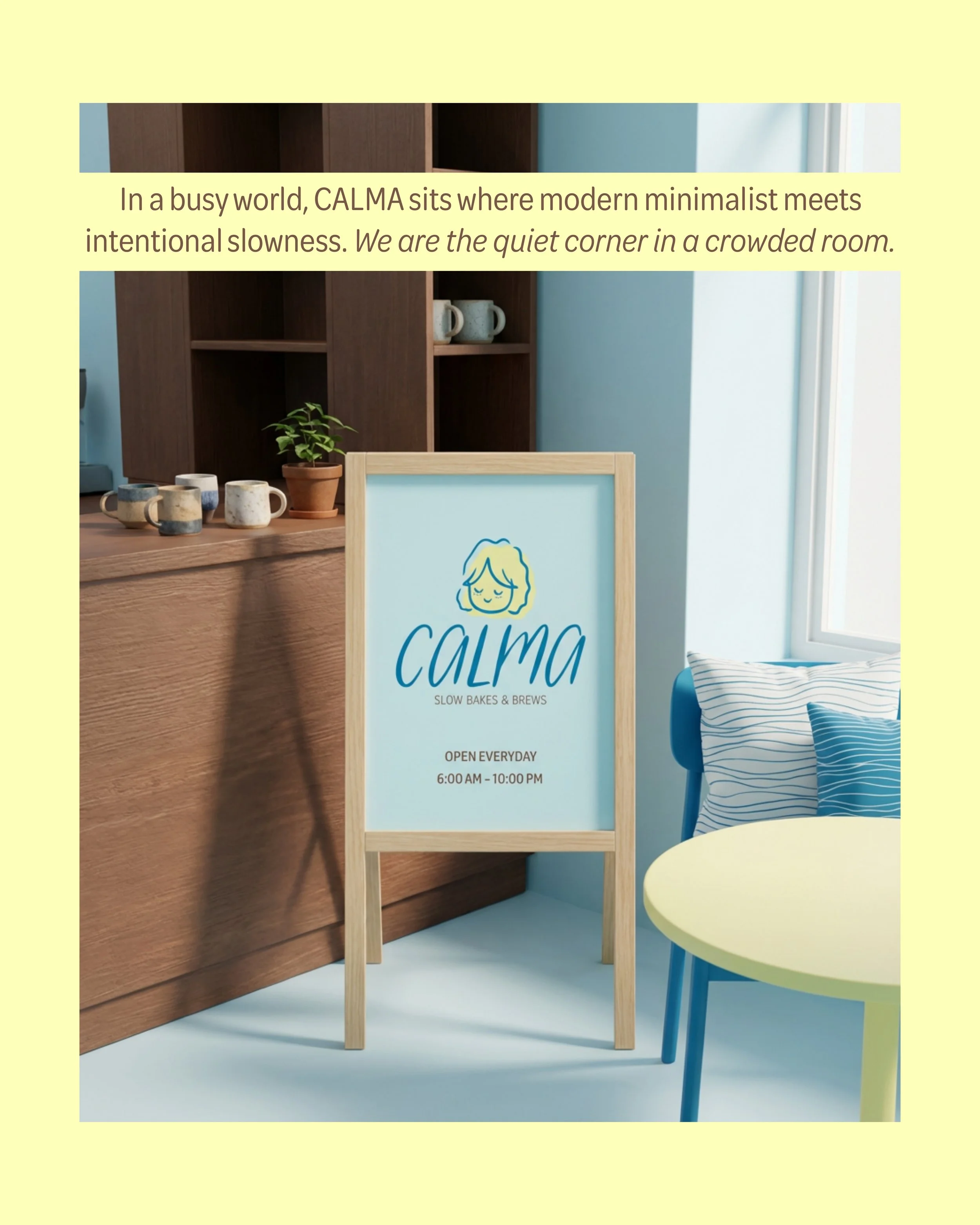
My goal here was to build a brand that embodies intentional slowness at every touchpoint, from relaxing, morning-inspired colors and soft, rounded typography up to tactile, comforting details.
In this project, I explored how strategy, design, and atmosphere can work together to create not just a café, but a sanctuary, proving that in a culture of hustle, gentleness can be a powerful differentiator. It really is a brand I wish existed!

❀ Audience & Messaging
❀ Audience & Messaging
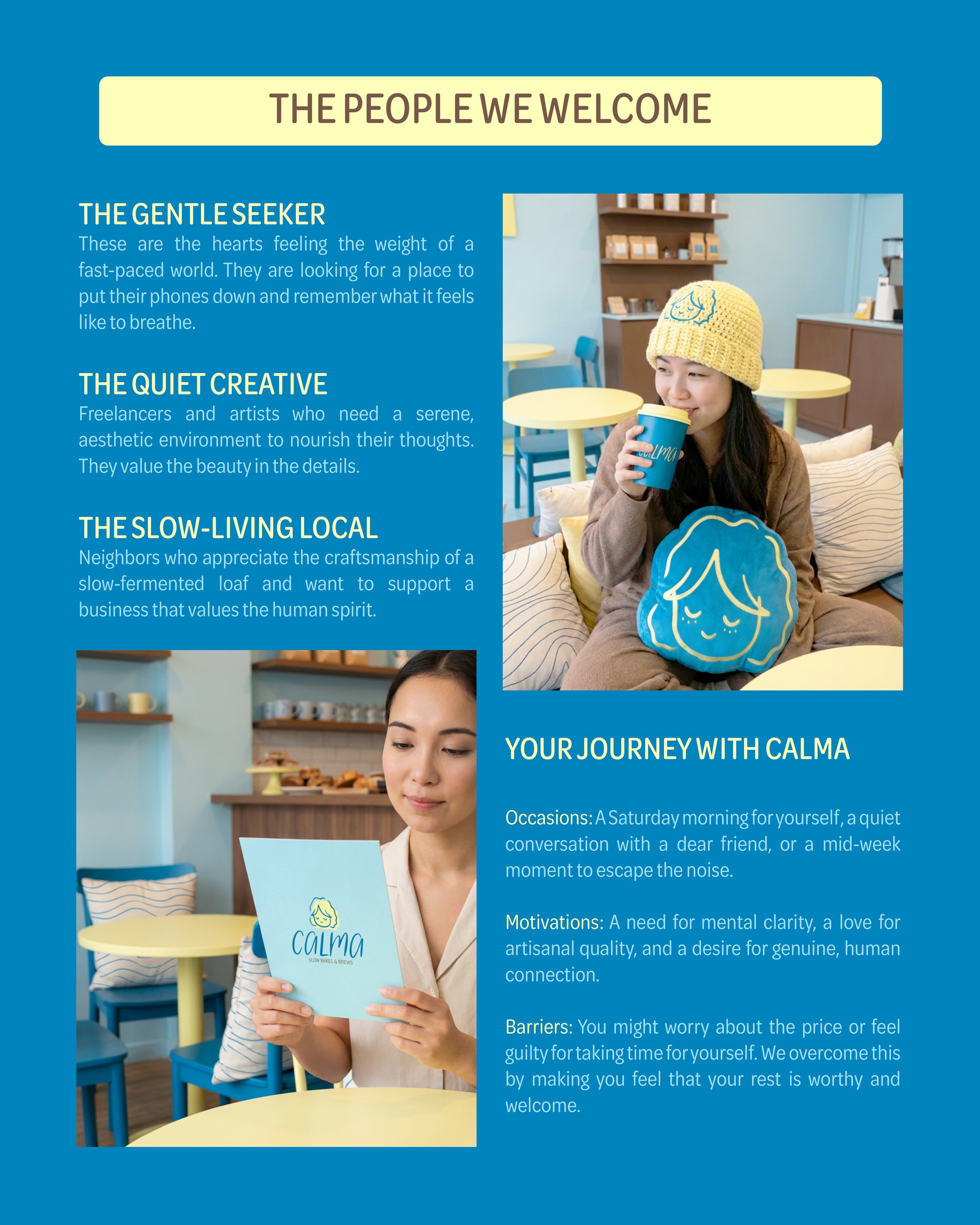
CALMA is the friend who pulls out a chair for you, pours you a cup of tea, and doesn't ask you to say a word. We are the Innocent (seeking a return to simplicity) and the Caregiver (offering a soft place to rest).
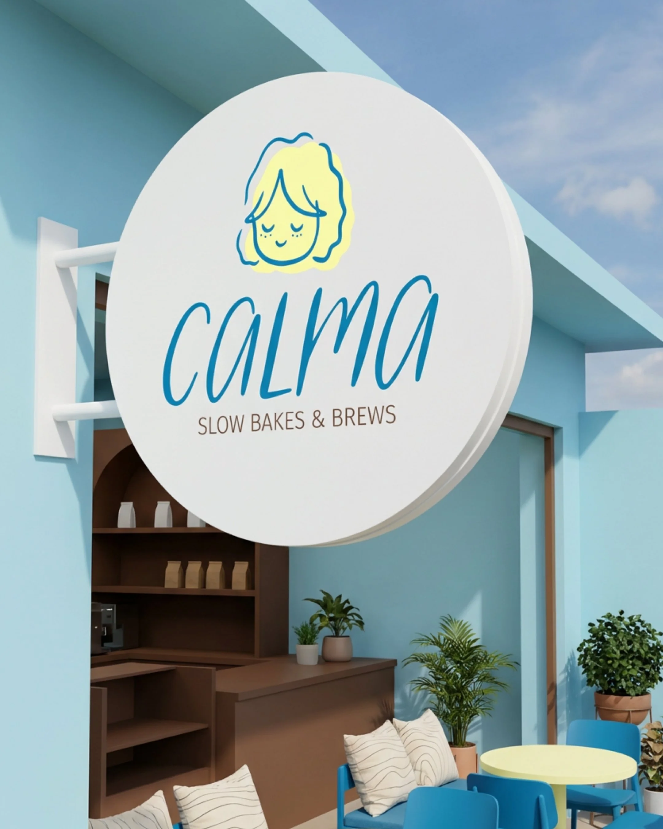
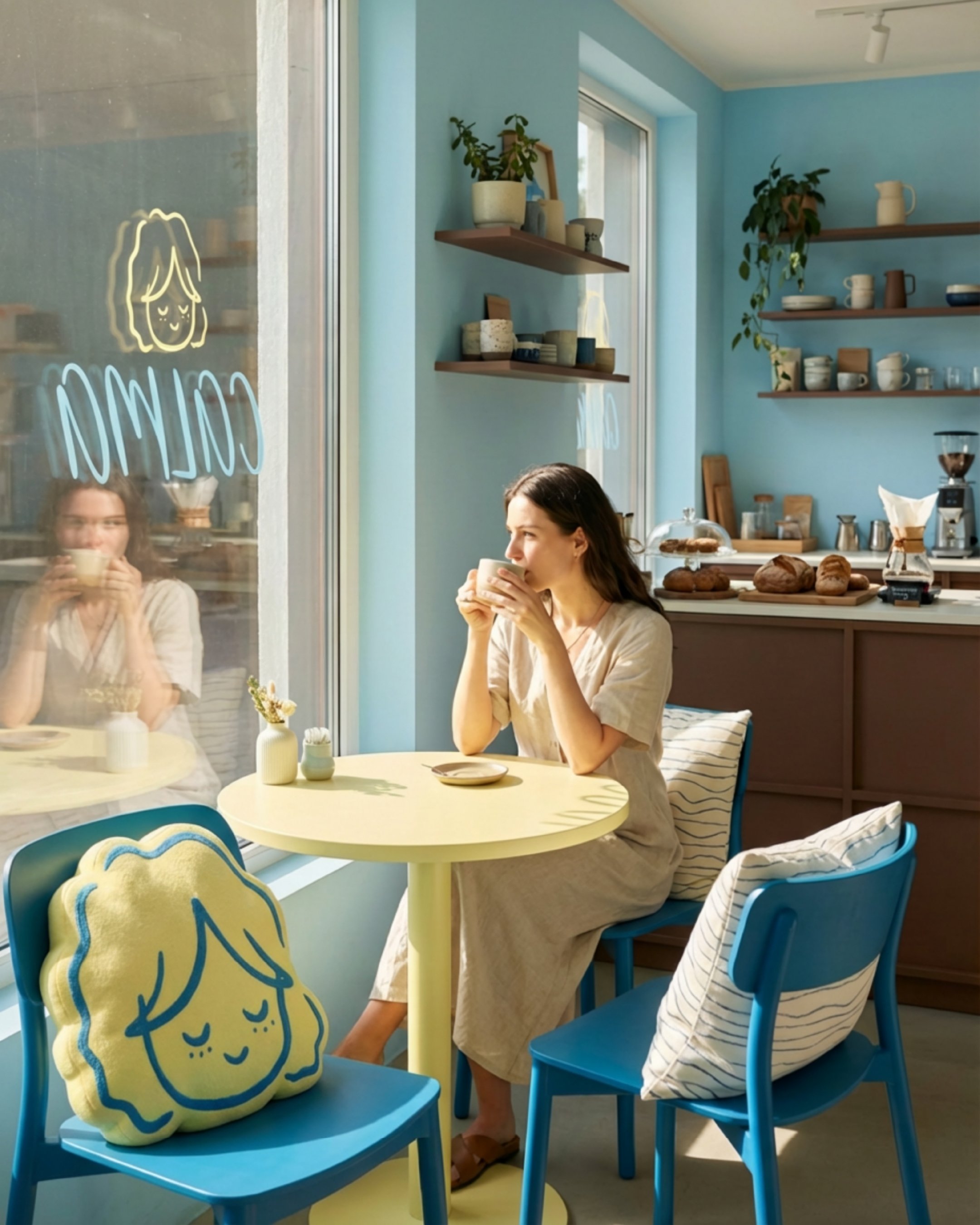
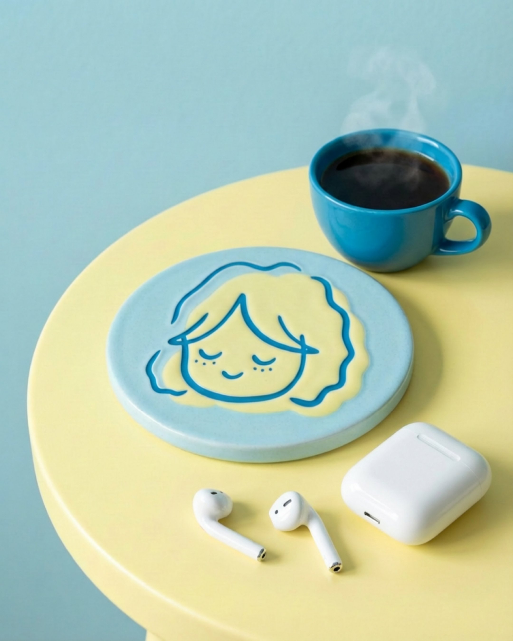
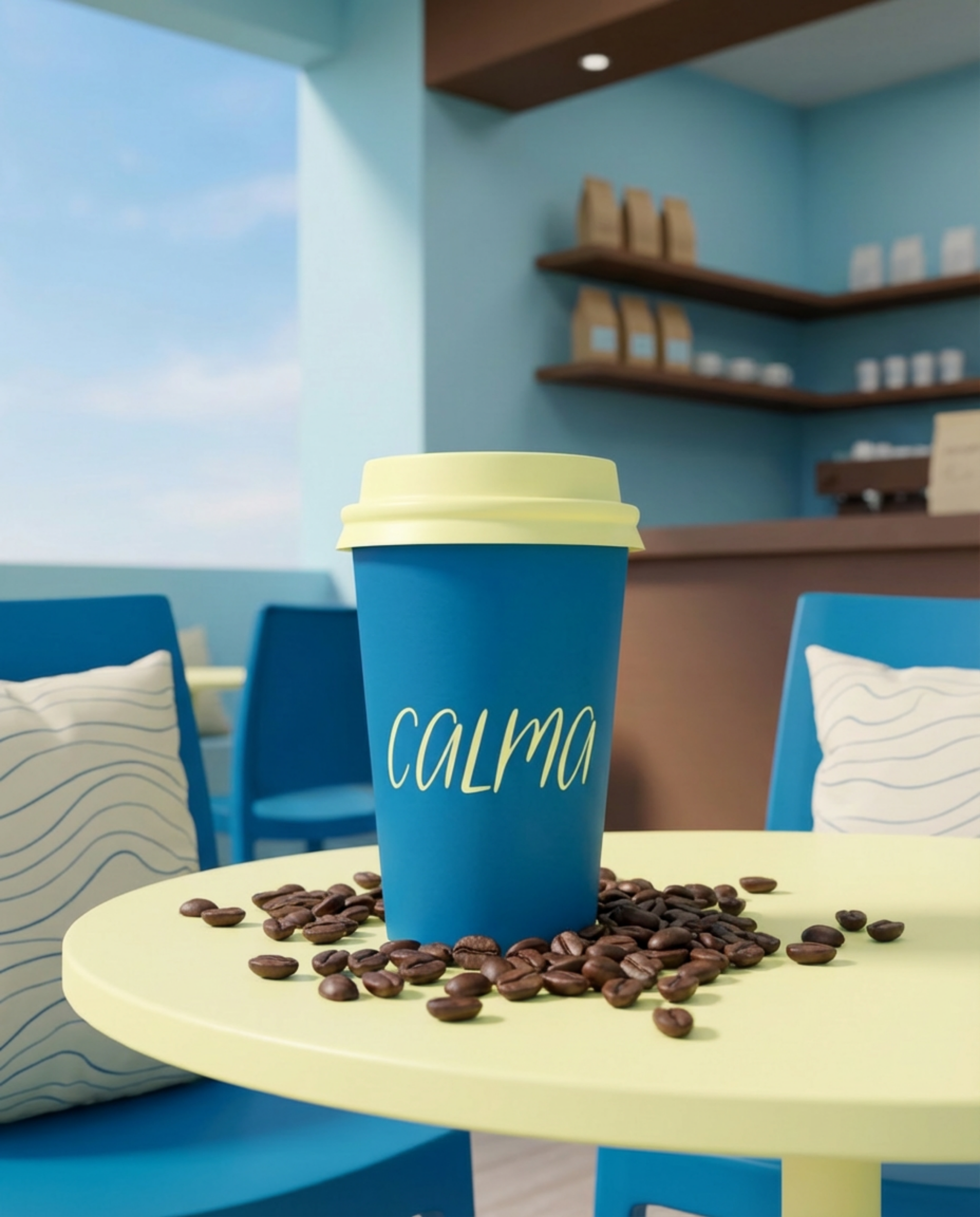
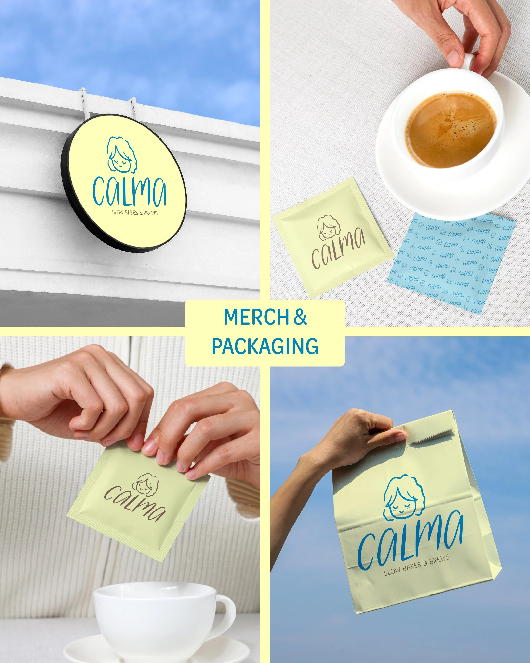
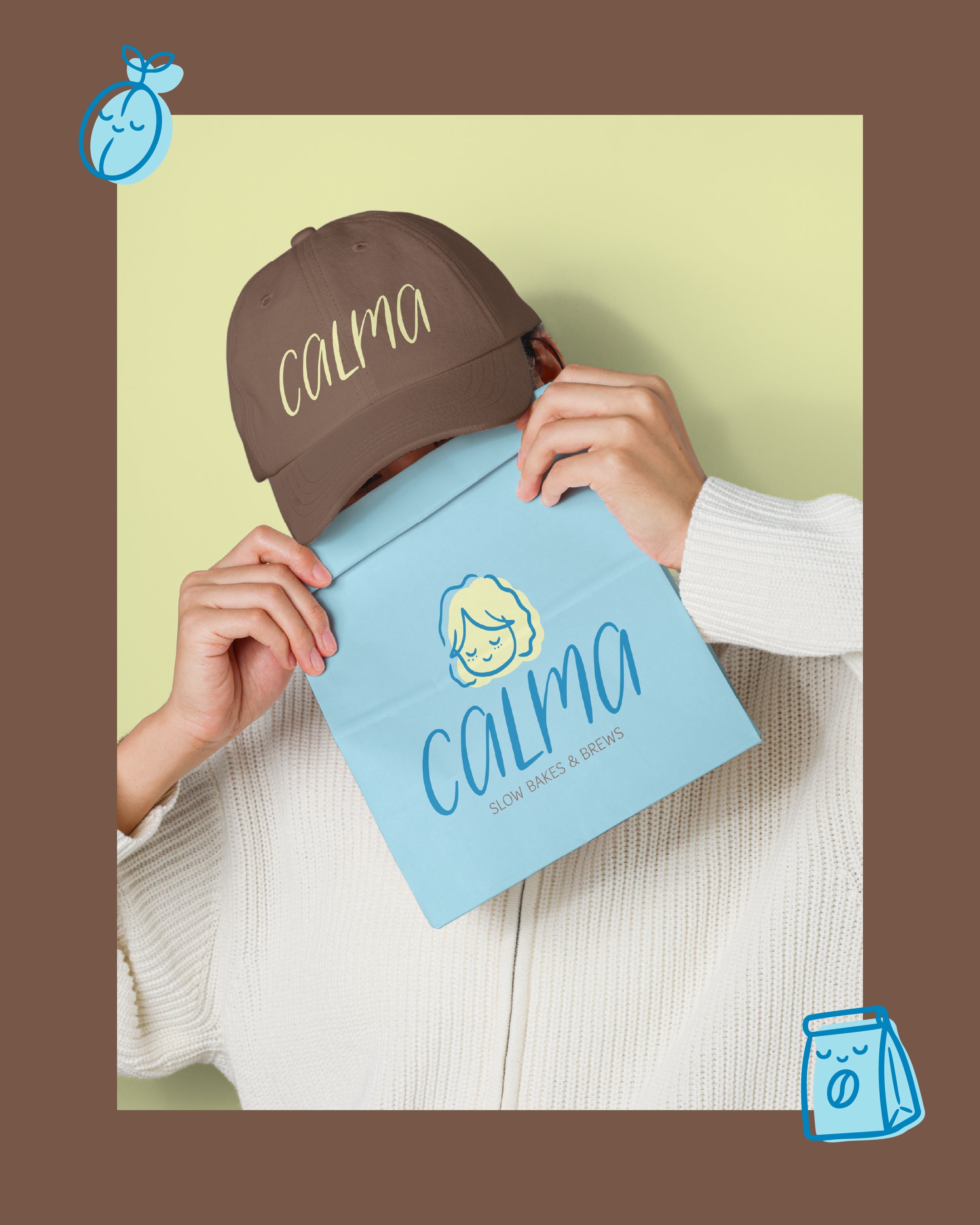
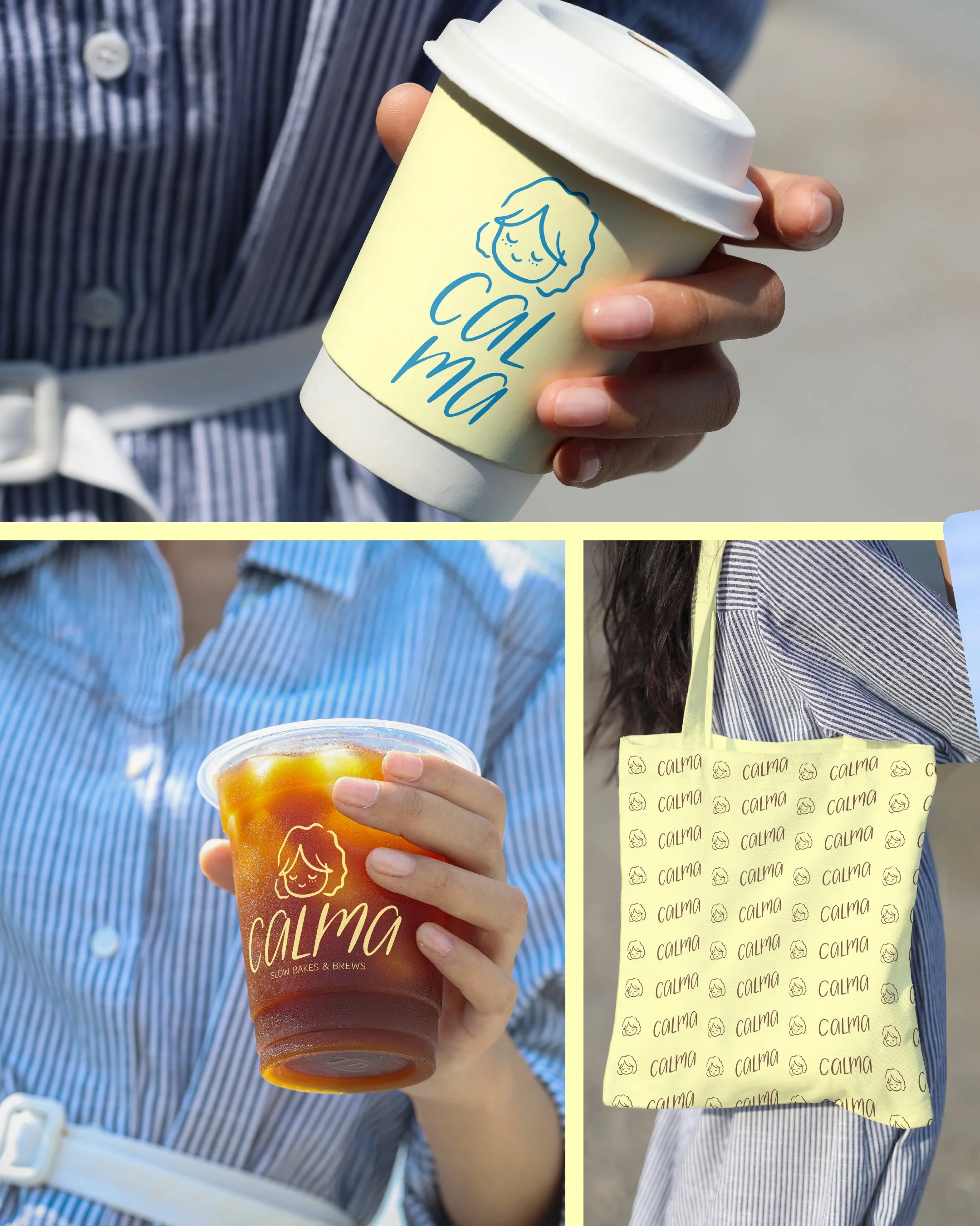
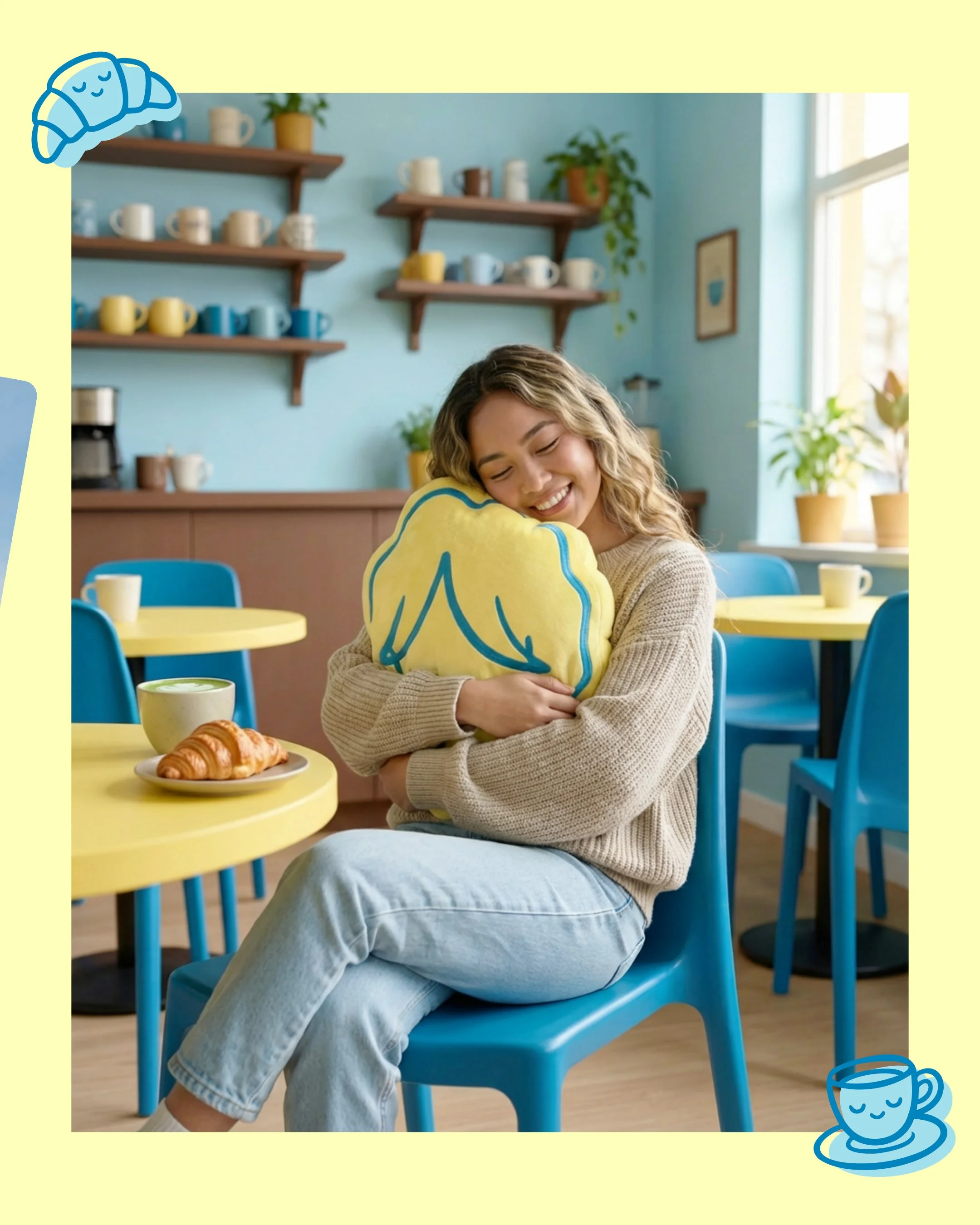
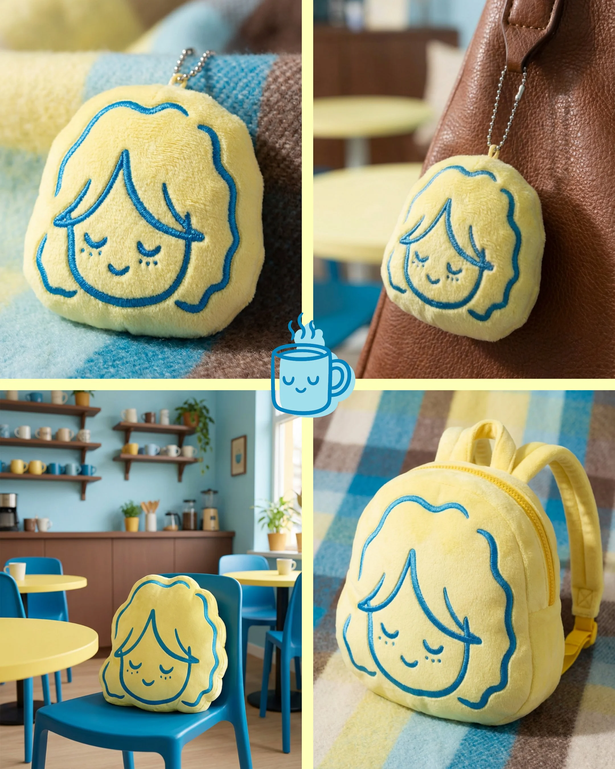
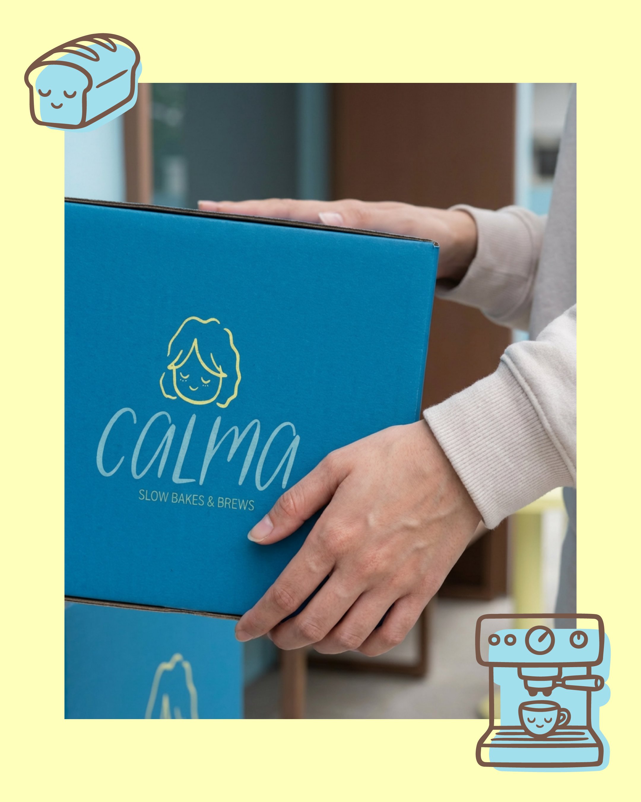
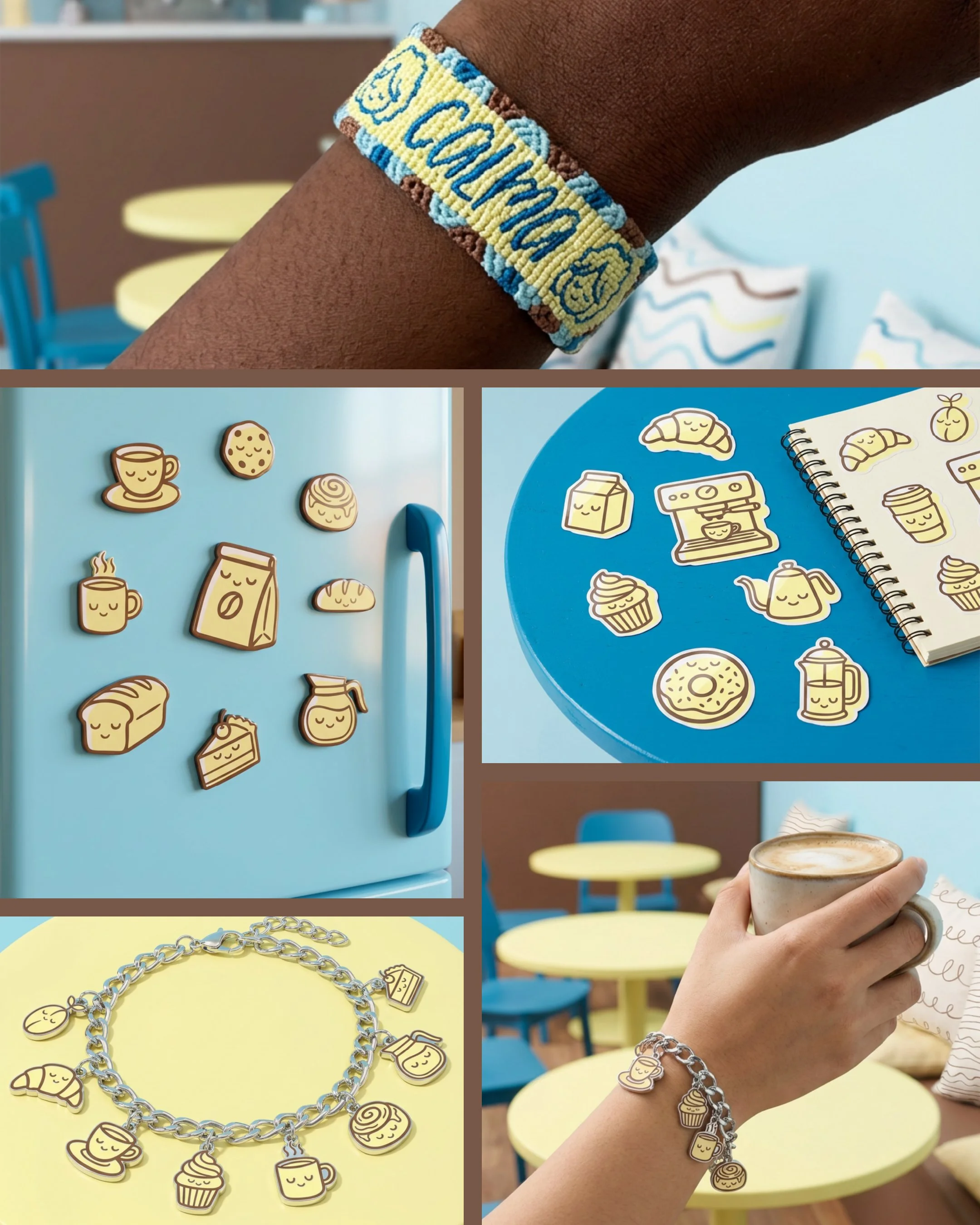
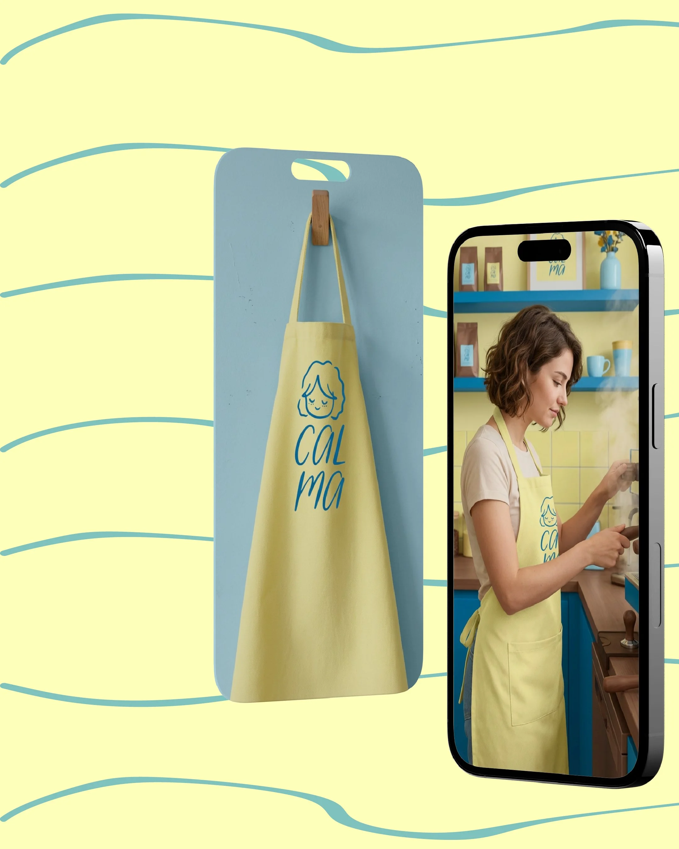
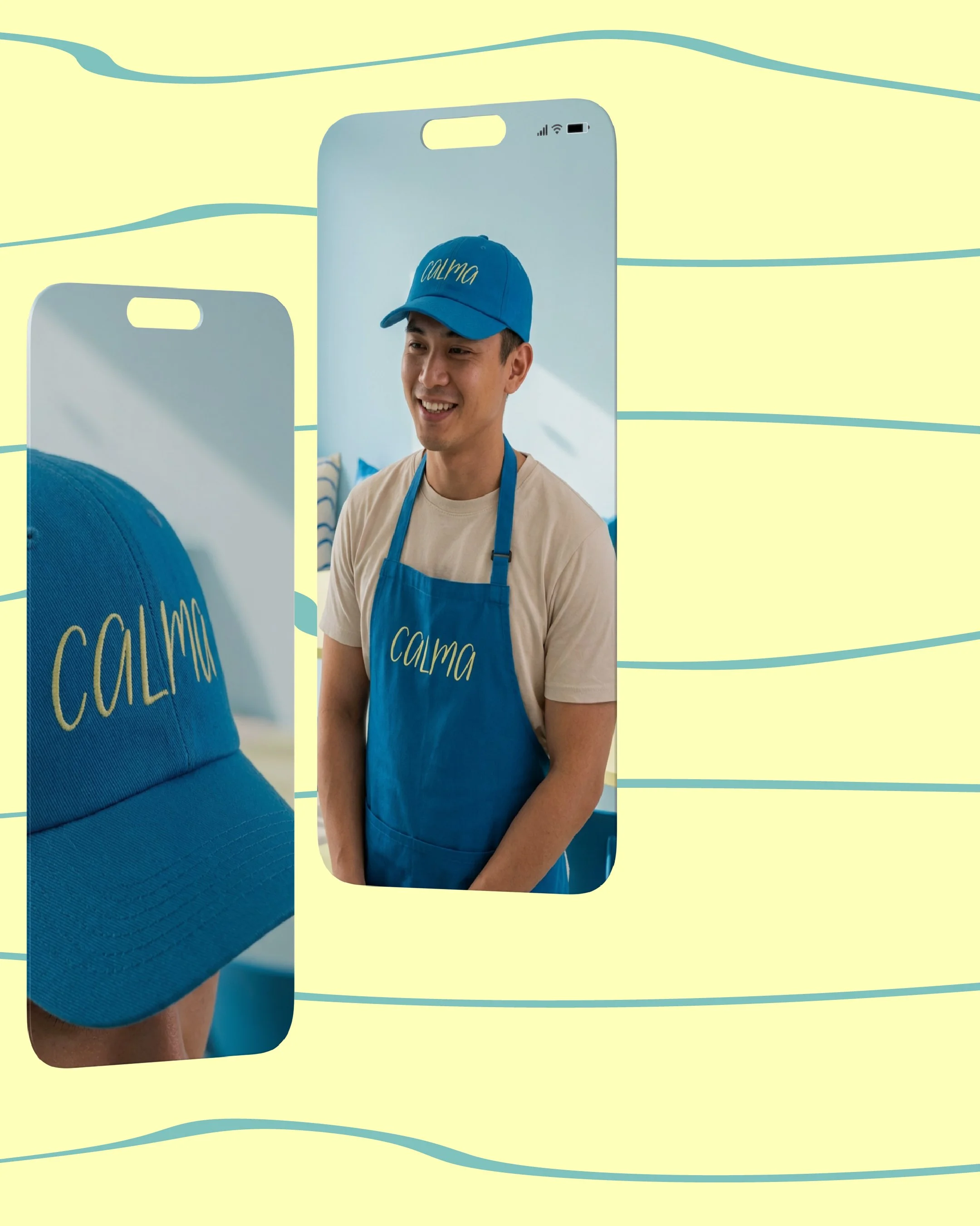
⋆˚꩜。 Brand in Action
⋆˚꩜。 Brand in Action
ᢉ𐭩 Behind the Scenes
ᢉ𐭩 Behind the Scenes
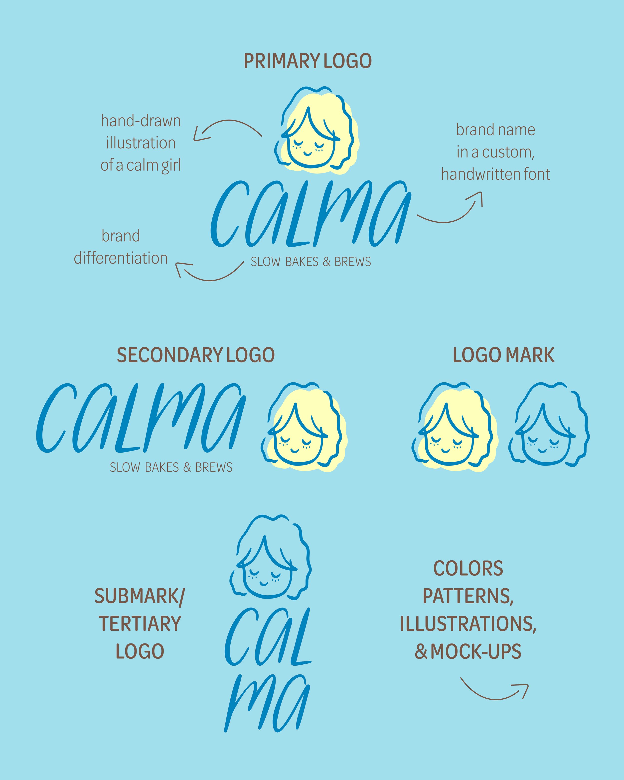
For the logo, I started with hand-lettering in Procreate. Once I was happy with how it looked, I brought the versions into Adobe Illustrator and used Image Trace to turn them into vectors.
From there, the real refinement began:
• Chose the best version
• Cleaned up anchor points and smoothed curves
• Reduced unnecessary points for cleaner paths
• Standardized all corner radiuses for consistency
• Fixed alignment and spacing (optically, not just mathematically)
• Polished the overall silhouette and balance
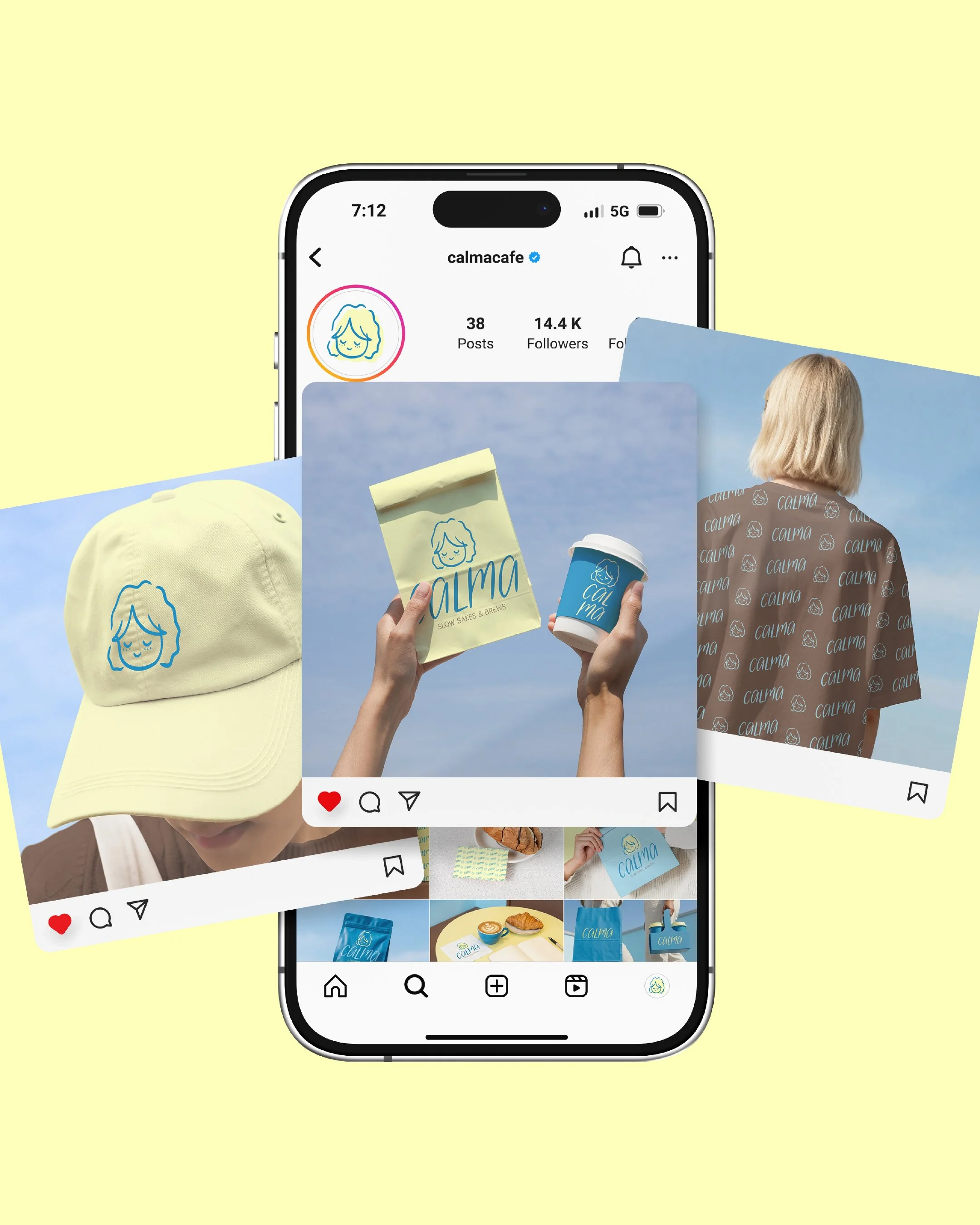
This is how I designed the first social media carousel post for CALMA.
I started by gathering all the pieces into one place and finding a gentle flow for our kuwento (story).
It begins with a short love letter to the brand, followed by our logo, colors, and patterns. And finally, seeing how it all comes to life in the real world at a human pace.
This is how I designed the third carousel post.
I started by laying out all the assets inside Adobe Illustrator, setting up 10 artboards to see the full story at once.
From there, I grouped images that felt strong together, then rearranged them until the flow felt balanced and intentional.
Once the structure was right, I refined each artboard individually — adding brand colors, layering in illustrations, adjusting layouts, and continuously rebalancing as I go.
The video runs 3 minutes (and it’s already sped up), which is a testament to the strategy and heart we give to every project at a human pace.